The Racial Landscape method introduces a consistent framework for visualization and quantification of the spatial distribution of racial subpopulations in arbitrary, user-defined regions by using high-resolution race-specific grids instead of census subdivisions. In the RL method, a race-specific grid with the subpopulation densities assigned to each cell is translated into the categorical grid (called a racial landscape) with two attributes - a racial category and the subpopulation density. Such a grid visualizes racial distribution but at the same time also provides geospatial data to calculate two metrics to numerically summarize the level of racial segregation (measured by mutual information) and racial diversity (measured by entropy). Both metrics can be calculated directly from high resolution grids for any user-defined region.
The racial landscape method has been implemented in the R package - raceland (https://cran.r-project.org/web/packages/raceland/).
More information:
Original paper introducing racial landcape method:
- Dmowska, A., Stepinski, T. F., & Nowosad, J. (2020). Racial Landscapes–a pattern-based, zoneless method for analysis and visualization of racial topography. Applied Geography, 122, 102239. [paper] [preprint]
Documentation associated with the raceland package:
- Introduction to racial landscape method
-
Describing local racial patterns of racial landscapes at different spatial scales
More about Racial Landscape
- How to create a Racial Landscape? - a simple description showing how the Racial Landscape (RL) grids are constructed.
- How does the stochastic nature of the racial landscape affect the accuracy of segregation and diversity metrics? - A test performed using 51 counties illustrates how the number of realizations influences the resultant values of segregation and diversity metrics. The conclusion from this comparison is as follows: the deviation of segregation and diversity metrics is so small that the number of realizations used to calculate diversity or segregation metrics (1, 5, 10, 20, 30, 40, or 50) does not affect the ranking of counties. This conclusion will stand in all cases when RL will be calculated using the smallest available aggregation units that are relatively racially homogenous.
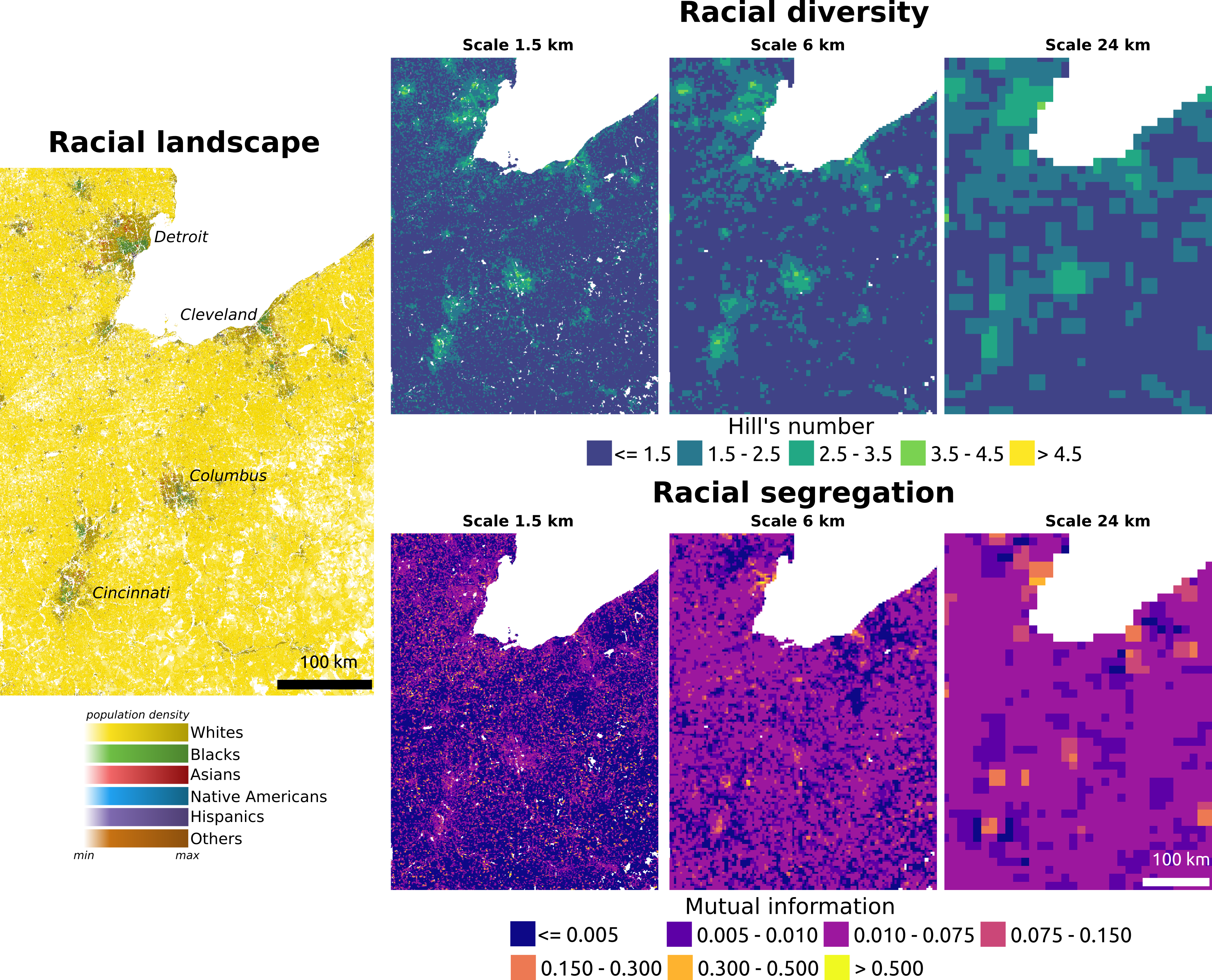
Examples
The example below shows three types of maps for the area centered in the Ohio state. The map on the left depicts racial distribution in the analyzed area. The colors on the map indicate the ethnoracial categories (yellow corresponds to whites, green to blacks, red to Asians, purple to Hispanics, blue to Native Americans, and brown to others), whereas the shades correspond to the population density.
The top row shows the spatial distribution of racial diversity, and the bottom row depicts racial segregation calculated for three different scales (1.5 km, 6 km, and 24 km). The racial diversity is presented using Hill's number, interpreted as an effective number of ethnoracial groups living in the area. The maps illustrate how segregation and diversity vary according to the scale. In general, with the larger scale, the area became more diverse and less segregated. The maps also present how the level of segregation and diversity differ between large cities, suburban, and rural areas.