In such a multiracial society as the United States, residential segregation and racial diversity have been of great interest to researchers and policymakers. Traditionally, residential segregation and racial diversity are measured and summarized by single number indices (dissimilarity index, Theil index). Recently, researchers have turned more towards spatial analysis. Therefore, mapping races has become more popular in demographic studies but is still not widely used. The limitation in incorporating maps in demographic studies can be due to limited access to free, ready-to-use map resources.
The issue of how to design maps to best depict racial distribution became increasingly important. Some maps can serve only as visualizations, while others can be used for visualization purposes and provide data for spatial analysis of racial distribution.
Census-based maps vs. high resolution grids
The majority of maps illustrating demographic data are choropleth maps. They divide the study area into US Census areal aggregation units (for example, census tracts) and color these units to depict the spatial variability of a demographic variable (for example, the share of a particular race or racial diversity category). Choropleth maps suffer from low spatial resolution and the modifiable areal unit problem. They are also restricted to the visualization role.
High resolution grids have a higher spatial resolution, don’t suffer from the MAUP, and double as visualization and data. Such data is in a format that allows for a more detailed analysis than the original census data.
TYPE OF MAPS
Percentage maps
Percentage maps show the spatial distribution of a particular race. Each unit (or cell in high resolution grids) is colored according to the share of people of a given race in an overall population in this unit.
In the census-based map, color is assigned to the aggregation units (i.e., census tract), creating a choropleth map; in the grid-based map, color is assigned to each cell (a square having the size of 30x30m for the SocScape project data).
Such a map can illustrate the distribution of a single race/ethnicity group at a given time; a set of maps is required to show the racial composition of a study area.
High resolution grids that can be used to prepare percentage maps are available here.
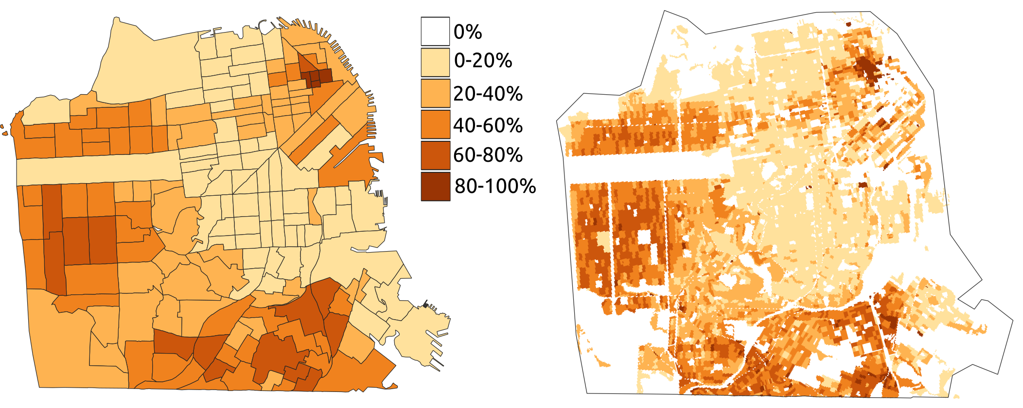
Fig. 1. Example of percent maps (census-based on the left and grid-based on the right)
Diversity/dominant race map
The diversity/dominant race map shows the spatial character of the neighborhoods in a single, easy-to-understand map. Each category, depicted by color, indicates the level of diversity and a dominant race.
In the census-based map, color is assigned to the aggregation units (i.e., census tract), creating a choropleth map; in the grid-based map, color is assigned to each cell (a square having, i.e., the size of 30x30m).
Such a map conveys the most important information about racial geography, but it only indicates the dominant race, leaving the identities of minority races unknown.
Grid-based racial diversity data for 1990, 2000, and 2010 for counties and metropolitan areas are available here. The Mixed Metro project provides census tracts classified by race and diversity.
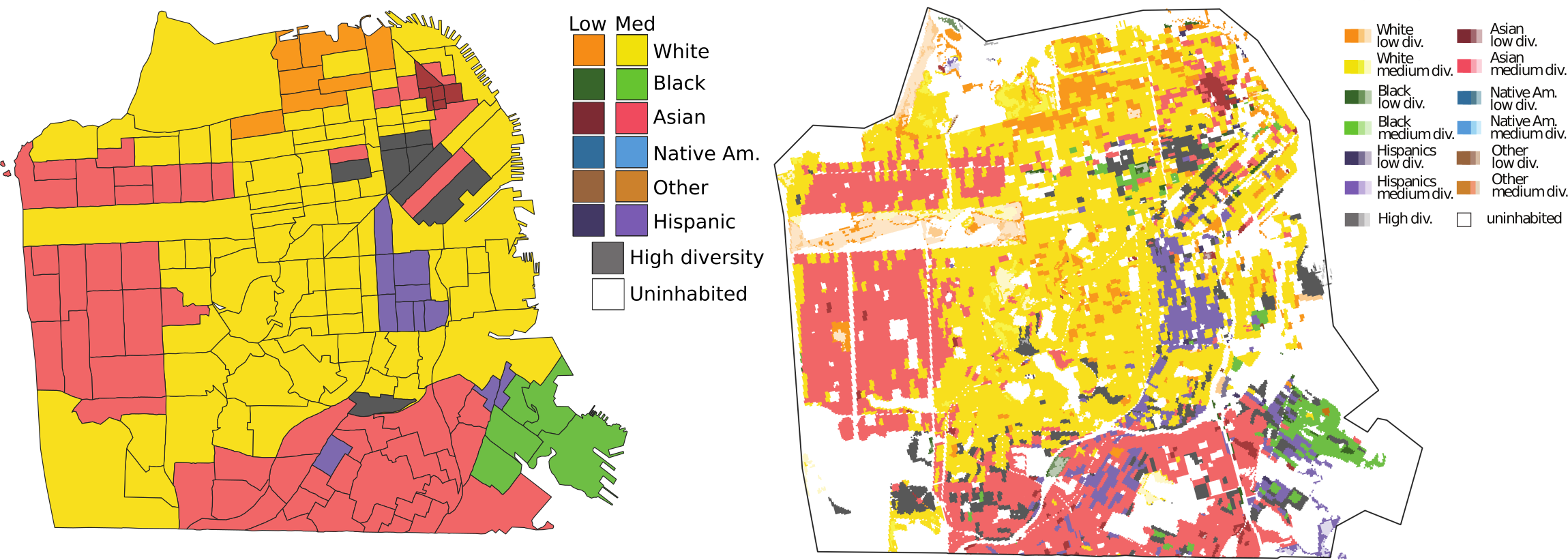
Fig. 2. Example of diversity/dominant race map (census-based on the left and grid-based on the right)
Racial dot map
A racial dot map conveys the spatial distribution of a population density and the full racial composition in a single map.
In a dot map, each dot represents one person, and it is colored by their race. The dot is placed as close to the person's location as the data allows for in the census block-based map dots corresponding to people inhabiting a given block and are placed randomly within this block. In the grid-based map, dots are placed in a grid cell (having, for example, a size of 30x30m). The difference is clearly visible when investigating the areas smaller than the entire city.
Grid-based racial dot maps for each county in 2010 are available here.
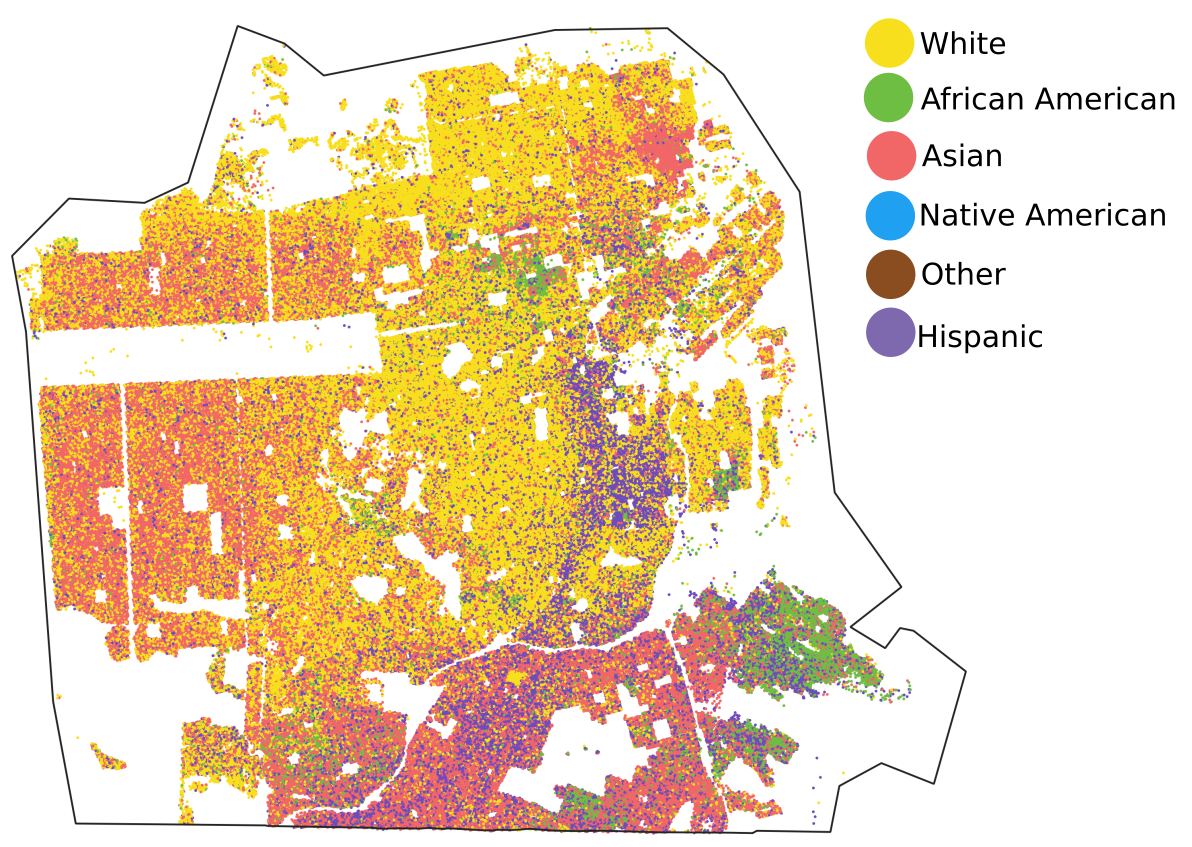
Fig. 3. Example of the grid-based racial dot map
Racial diversity change map
The racial diversity change map shows temporal changes in racial diversity/dominant race as a single map. Changed areas are shown in stripes, with the color of narrower stripes indicating the earlier year (1990) and broader stripes indicating the later year (i.e., 2000). Unchanged areas are shown in original color assign to this class in racial diversity maps (see legend in fig.2A).
Racial diversity change maps for 1990-2000, 2000-2010, and 1990-2010 comparisons for urban areas within metropolitan areas can be downloaded here.
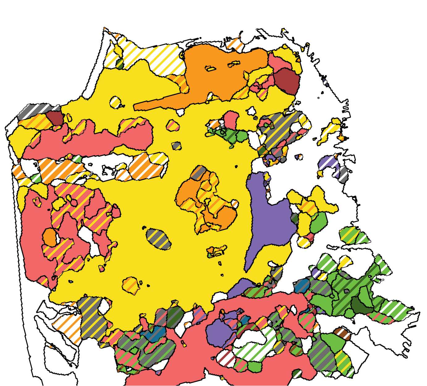
Fig. 4. Example of a map showing changes in diversity/dominant race between 1990 and 2000